Tomlinson Corporate Headquarters
Ottawa, Ontario
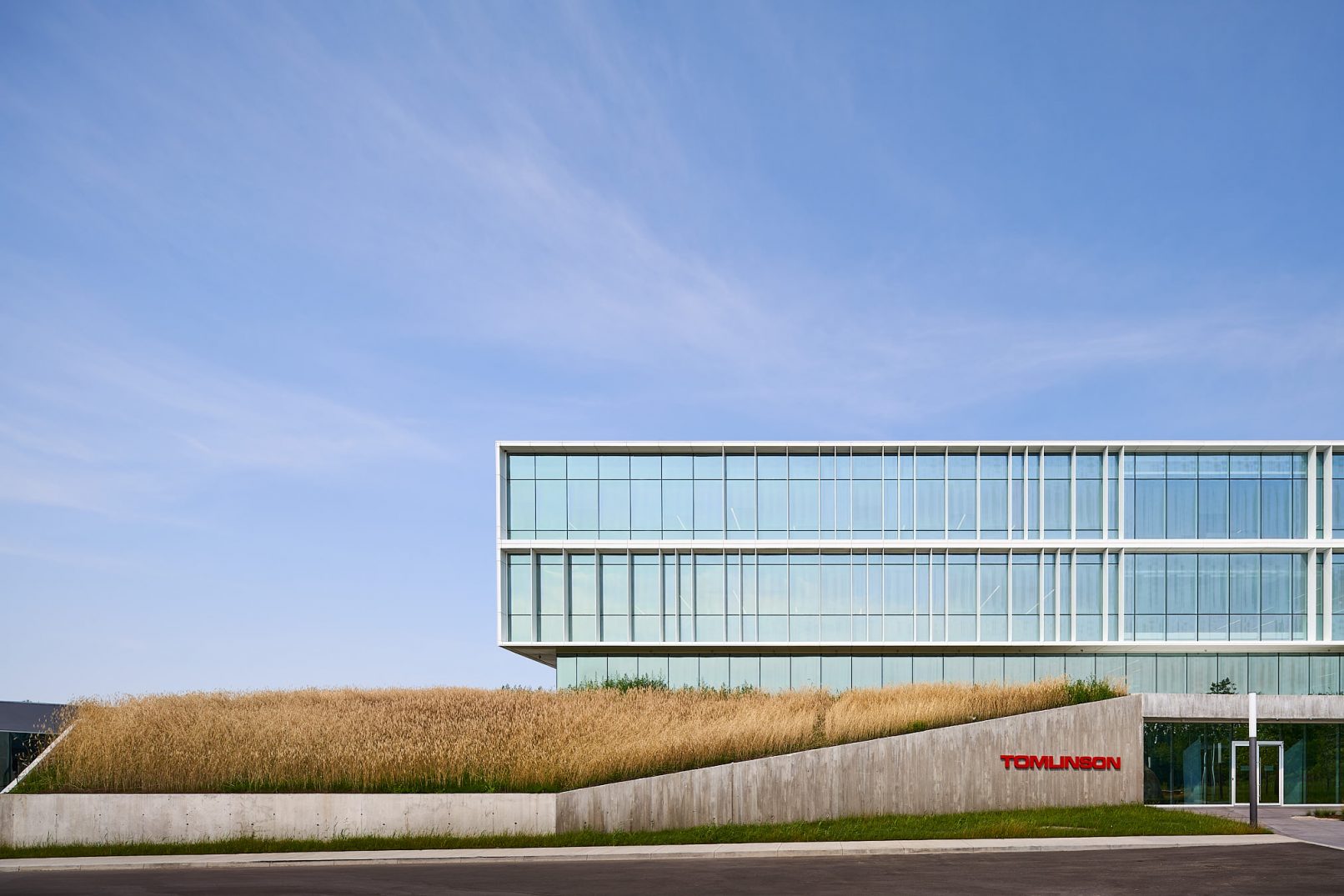
The need for a new headquarters building for the Tomlinson Group presented a unique opportunity for the company to communicate its values and demonstrate their business identity. The company’s involvement in mineral extraction, earthworks and infrastructure formed the basis for our design response and the core of what the building needed to convey. To that end, the project has been imagined as a restored and re-naturalized landscape within which the building emerges and over which it bridges. The building is inserted into an undulating, one-storey landscaped berm, which extends over the entire property. This berm is cut away and opens up at each entrance where the openings are lined with sloping, board-formed concrete. To arrive at the site and enter the building is to experience the strength of stone and earth on which The Tomlinson Group is based.
The ground floor is embedded into the landscaped berm; the strength of stone and concrete is apparent to all who pass in and out of the building. The second floor is level with the raised landscape and the third and fourth floors float above the ground. The four levels are connected by an interior atrium which extends across the width of building and into the adjacent entrance plazas. The atrium supports the development of a strong community of company members, creating visual connections between various departments, links between floors, and a “town square” setting for people to connect and interact.
The office floors are split and open onto the atrium. Collaborative work spaces and open office areas line the perimeter with glass enclosed offices surrounding the inner core.
Landscape is critical to the design and the company’s identity.
“This landscaping, in turn, bleeds down from the plinth into the plaza to the rear of the building, which makes a gracious and sophisticated transition from the parking areas to the atrium at the core of the building. The ground floor, organized around this atrium, accommodates a range of activities and is designed to be easy to move into and to from in numerous directions. This enables the building to function a bit like a hive. En route from one job to another, employees check in, grab a bite to eat, meet a client, check a document, then head out again to the next job site or appointment. The fact that all spaces open on to this central crossroads means that people are likely to spot and/or run into each other. This, in turn, builds cohesion for a company whose employees are required to be in so many different places at once. In addition to being a hive, then, the building is also a hub and a home base for the company’s peripatetic work force”
-Professor Benjamin Gianni, Azrieli School of Architecture & Urbanism, Carleton University, 2019
Year: 2018
Photography: Doublespace
Square footage: 80,000
Awards: 2019 Ottawa Urban Design Awards: Award of Merit for Urban Low-Rise Infill Projects


