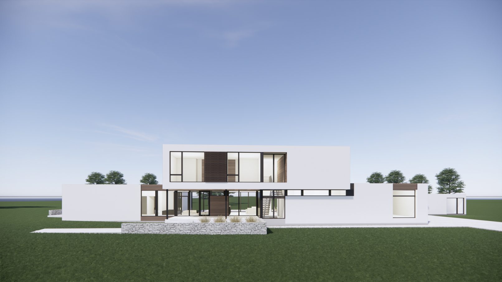
Summerstown House
An example of a new and growing need for intergenerational homes, this home design evolved primarily out of finding the right balance of private and common family spaces.
Its simple massing and minimal material palette, focused on marking important spaces mainly using its form. Overhangs mark and create a more impactful main entrance, as well as the protected exits out to the rear courtyard. Each accented with warm wood cladding and soffits.
The floor plan was developed with the aim to wrap and enclose the rear yard, thus giving a more protected and intimate yard space that is used by the entire family.
The main entrance opens to a common entrance hall overlooking a sunken, double height common living room that looks through a large expanse of windows onto the back yard. From this space, the home is flanked on both sides by both the family home on one side, and the parents’ private home on the other.
The home’s setting is wooded and private, therefore windows were maximized at the ground level. This adds to the fluid connection between the exterior and interior. Private views and outlooks are oriented toward the front.
Our client’s aim was to have an open, light, and warm feeling to their new family home. The limited and light material palette, its wood accents, lightened concrete floors, and the connection between the surrounding landscape and the interior spaces have all worked together to achieve this.


